A comprehensive Brand Strategy & Brand Design exercise for this startup specializing in wooden frame modular housing units.
“The same, yet uniquely different” (Hetzelfde, maar toch een beetje anders) serves as the brand tagline for Ekséko, perfectly encapsulating Christopher Van Roy’s message to companies, schools, and organizations. Drawing from his expertise and personal experience, Christopher intimately understands the challenges of living with autism on a daily basis—the nuances, sensory stimuli, and social interactions that may pose added difficulty. Our goal was to reflect this ethos in the brand design for Ekséko.
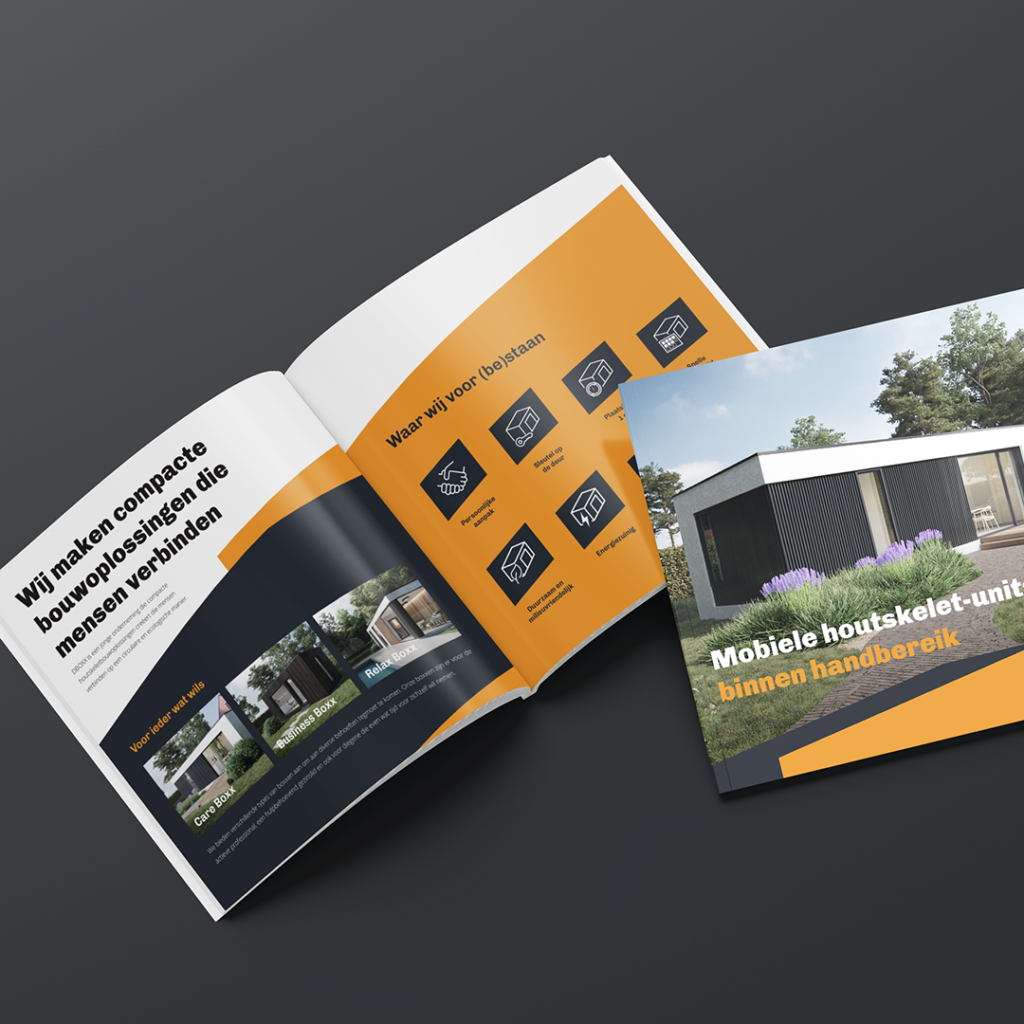
The mission
We create compact construction solutions that connect people.
The vision
A society where people can have an integrated and balanced life with themselves, their work, and their surroundings.
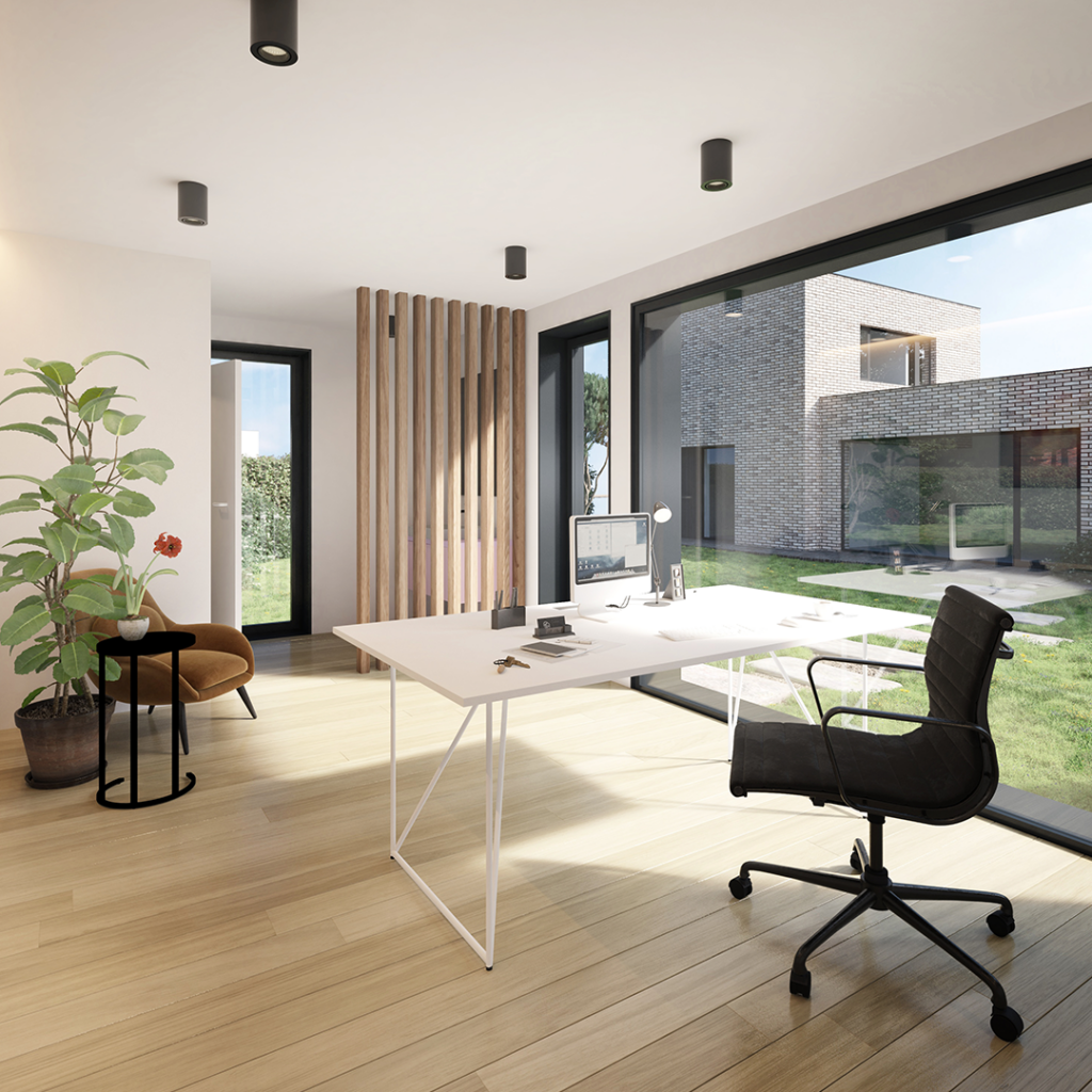
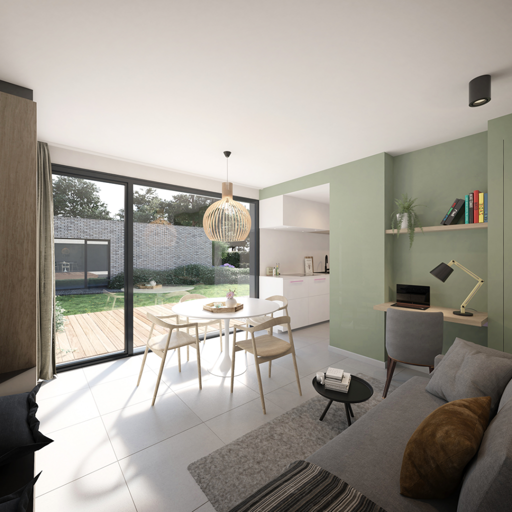
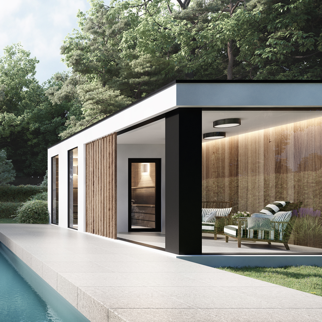
What do we do?
We create modular mobile units
For who?
People who want to take care of their own parents.
Careboxx
The young entrepreneur seeking their own workspace.
Businessboxx
People seeking extra luxury and tranquility.
Relaxboxx
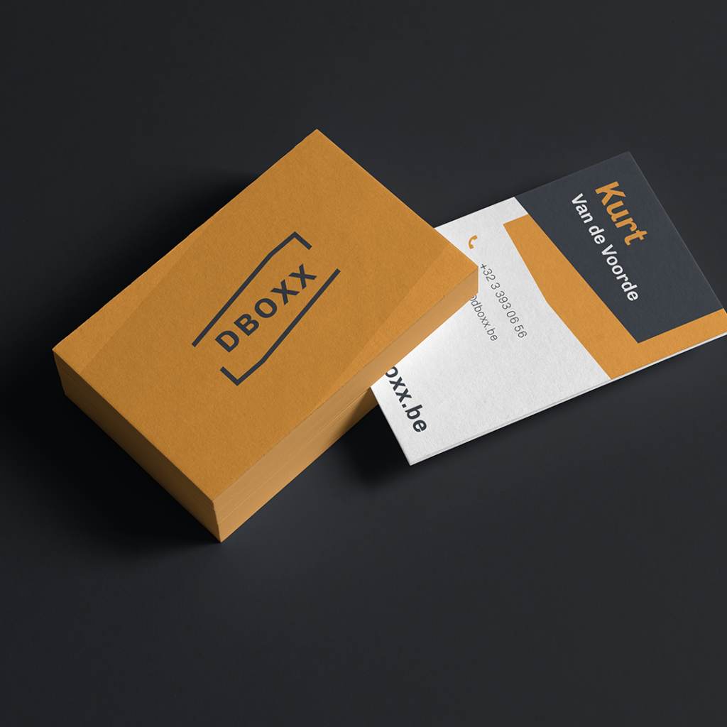
The logo
The logo for Dboxx is based on the shape of the unit itself and consists of 2 open forms that enclose the name, so to speak. These 2 open forms symbolize the variety and creativity that Dboxx can showcase in its modules.
3D Design by JSLvisual – Jeroen Slootmans Brand Strategy Parnter – Tom Vansteenkiste