A branding exercise for Christophe Van Roy who will work as a freelance autism consultant for companies and organizations.
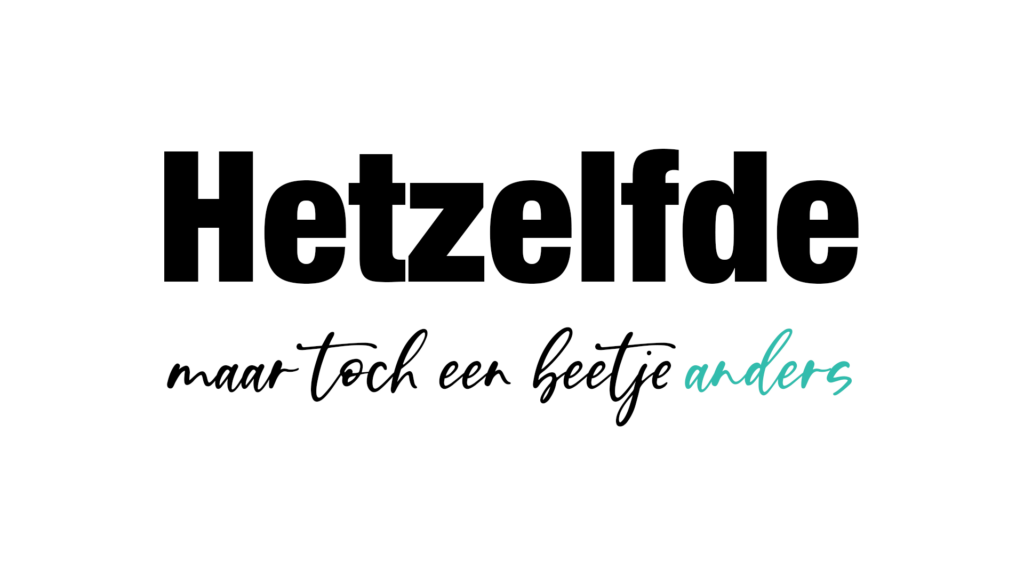
“The same, yet uniquely different” (Hetzelfde, maar toch een beetje anders) serves as the brand tagline for Ekséko, perfectly encapsulating Christopher Van Roy’s message to companies, schools, and organizations. Drawing from his expertise and personal experience, Christopher intimately understands the challenges of living with autism on a daily basis—the nuances, sensory stimuli, and social interactions that may pose added difficulty. Our goal was to reflect this ethos in the brand design for Ekséko.
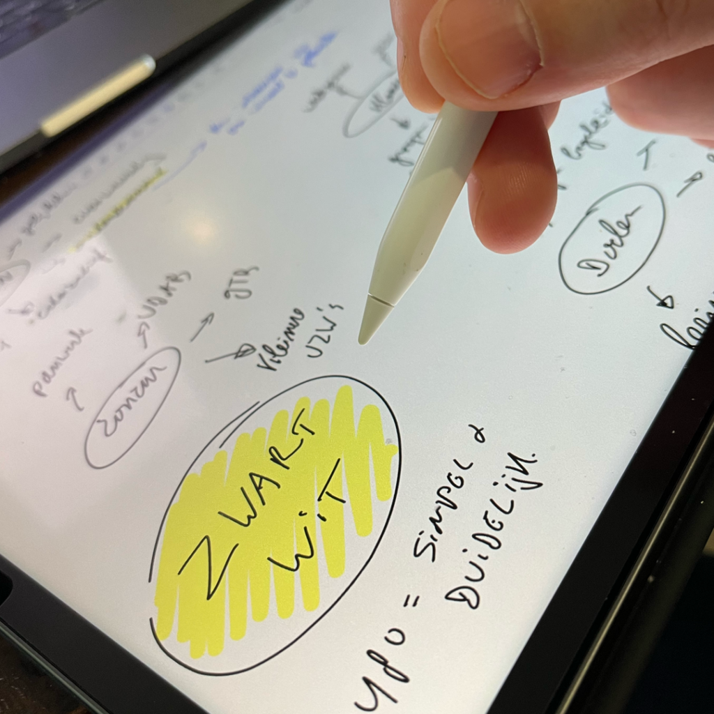
The design brief
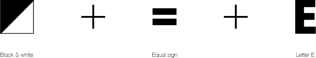
The design briefing was very clear: create a logo that conceptually translates equality and uses only black and white. This clear framework also reflects what people with autism often require. Simultaneously, it allows those without autism to understand what it’s like to live with autism—to often not see the whole picture, to experience too many stimuli, and to sometimes find it challenging to think or perceive beyond the framework.
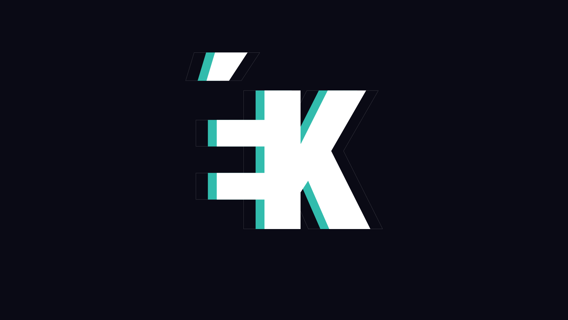
The logo
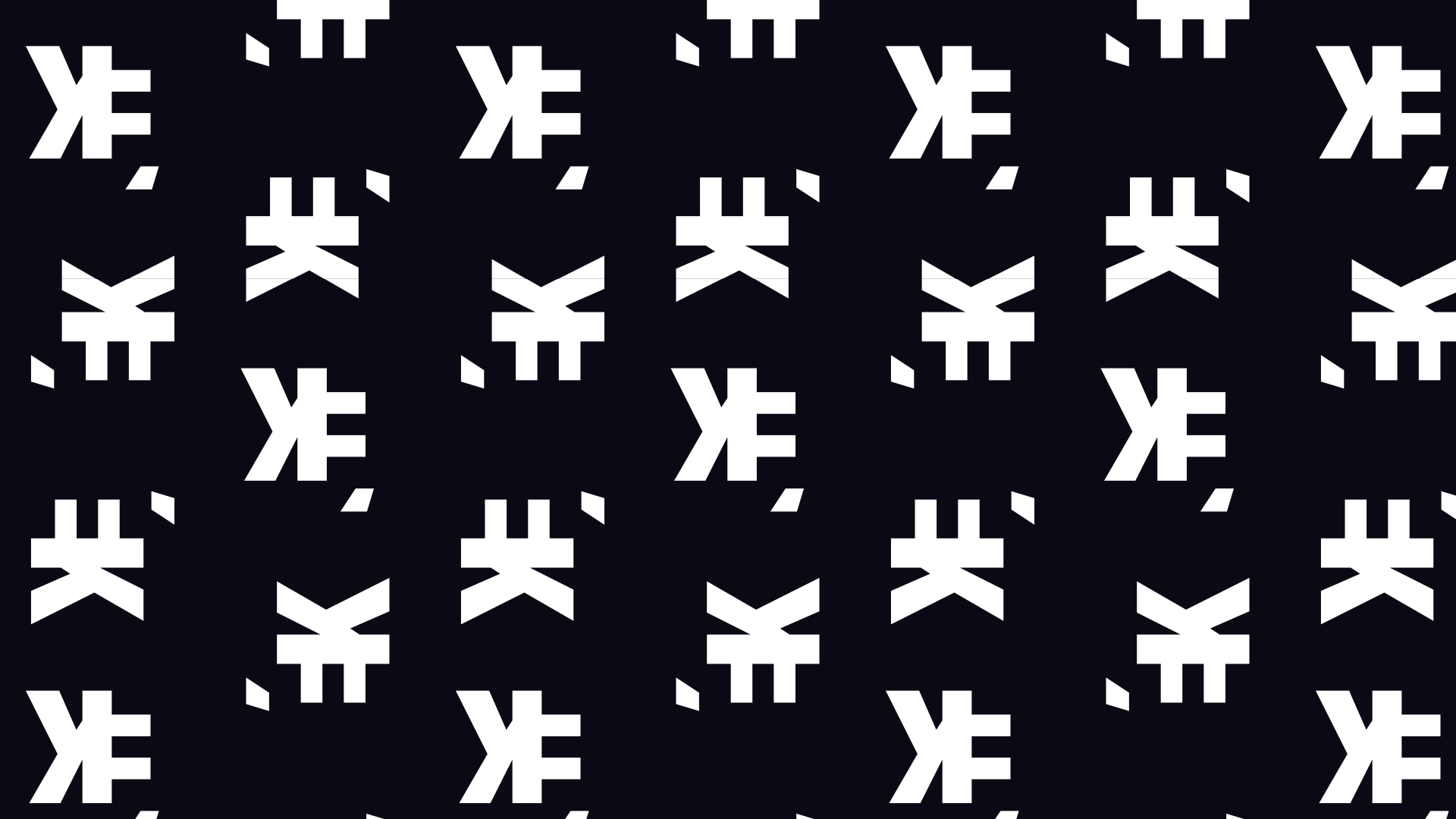
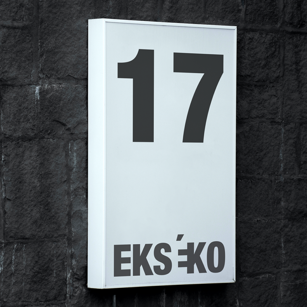
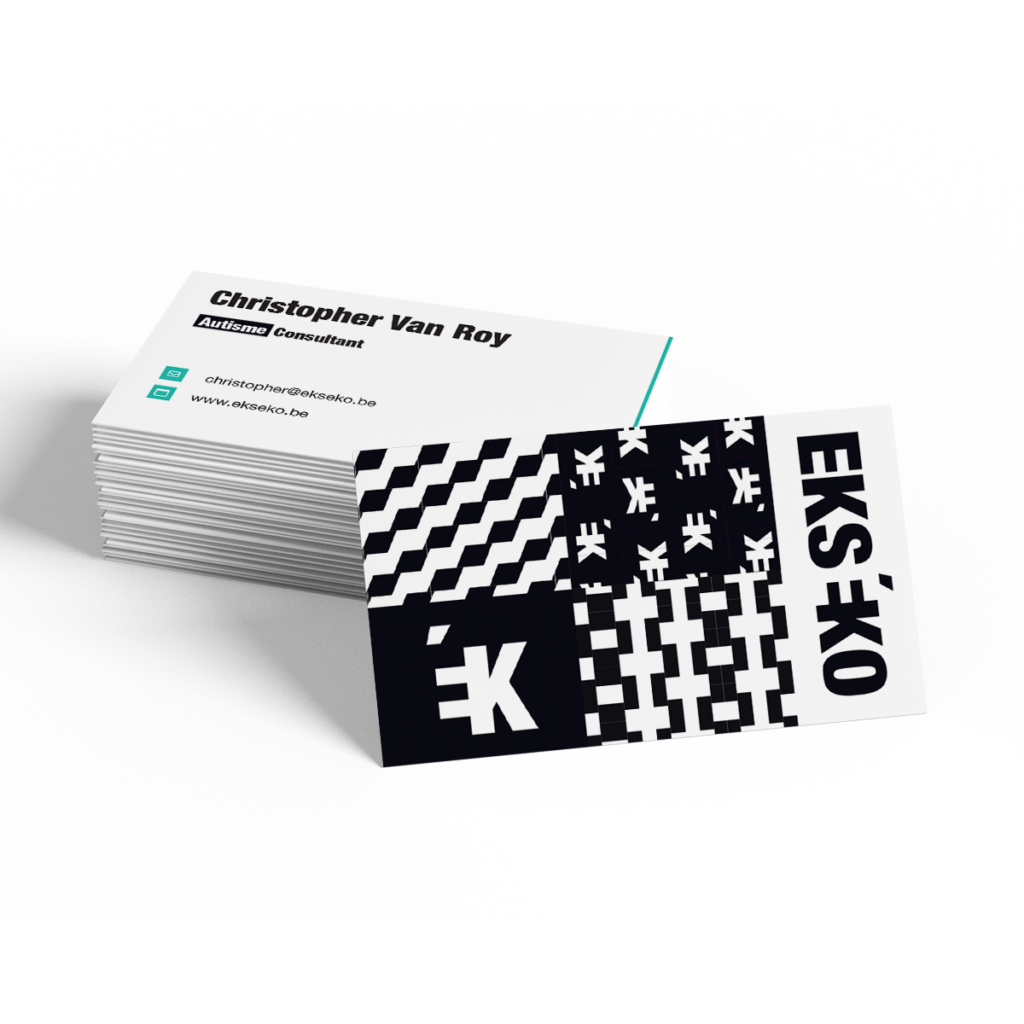
During my sketching phase, I quickly arrived at the idea of utilizing the white space within the capital letter “E” as an “=” sign. The black/white contrast is further enhanced by employing the letter “E” a second time in its negative form. This approach instantly conveys the narrative of Ekséko through the logo.
The brand tagline
During one of our strategic workshops, we focused on finding a Brand Tagline. “The same, yet a little different” encapsulates the way Christopher wants to position Ekséko in the world and his perspective on living with autism.
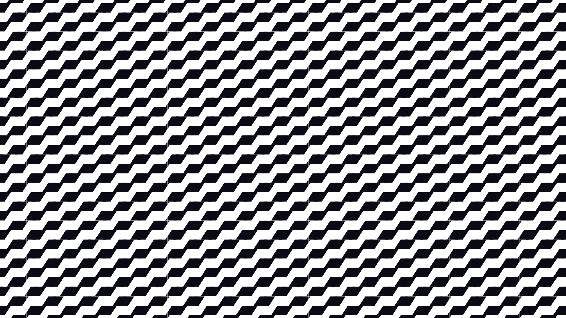
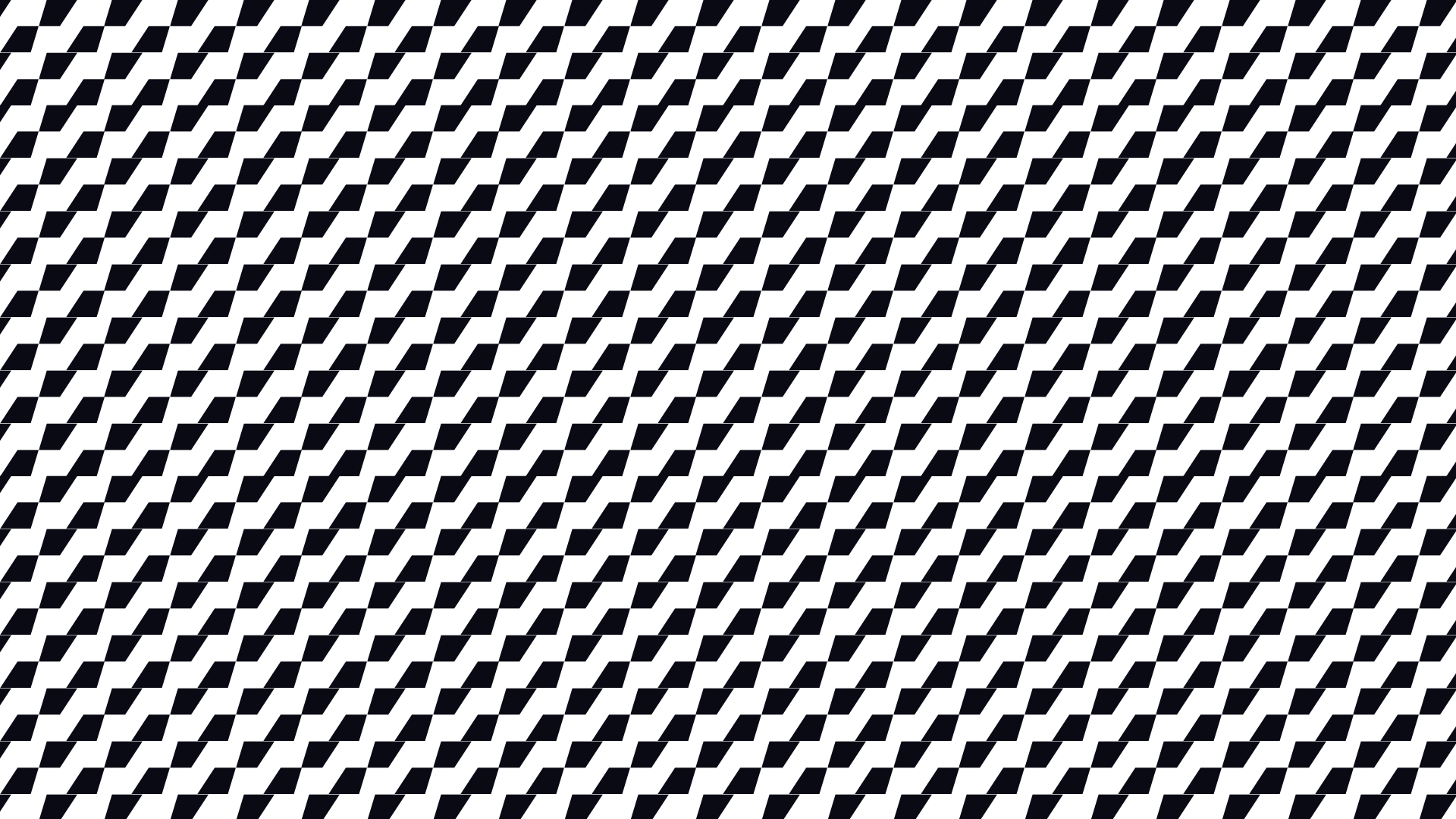
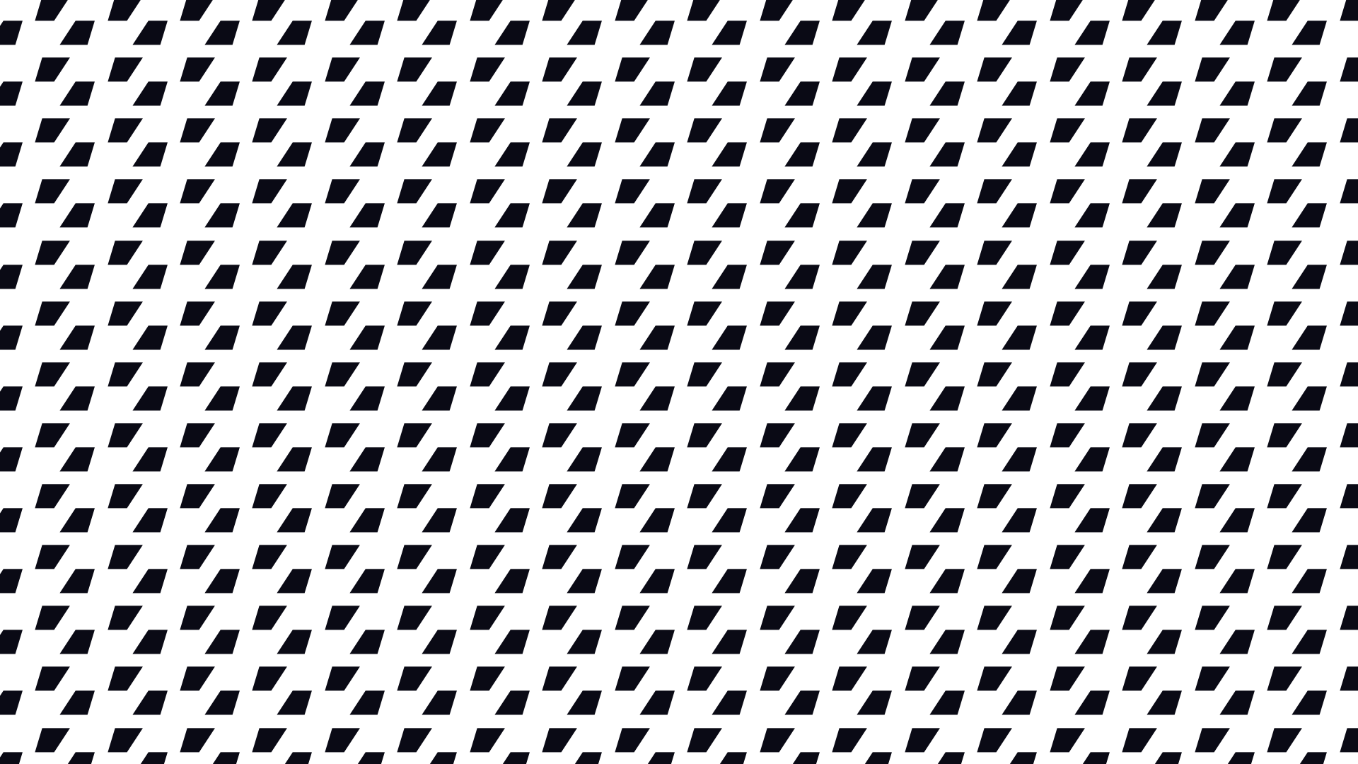
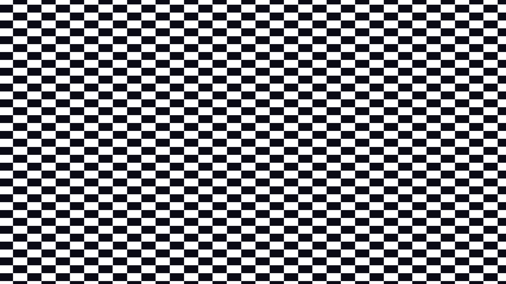
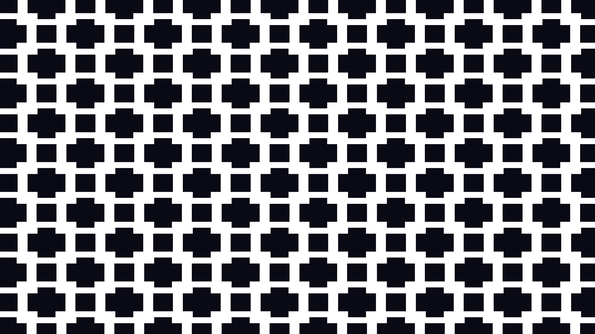
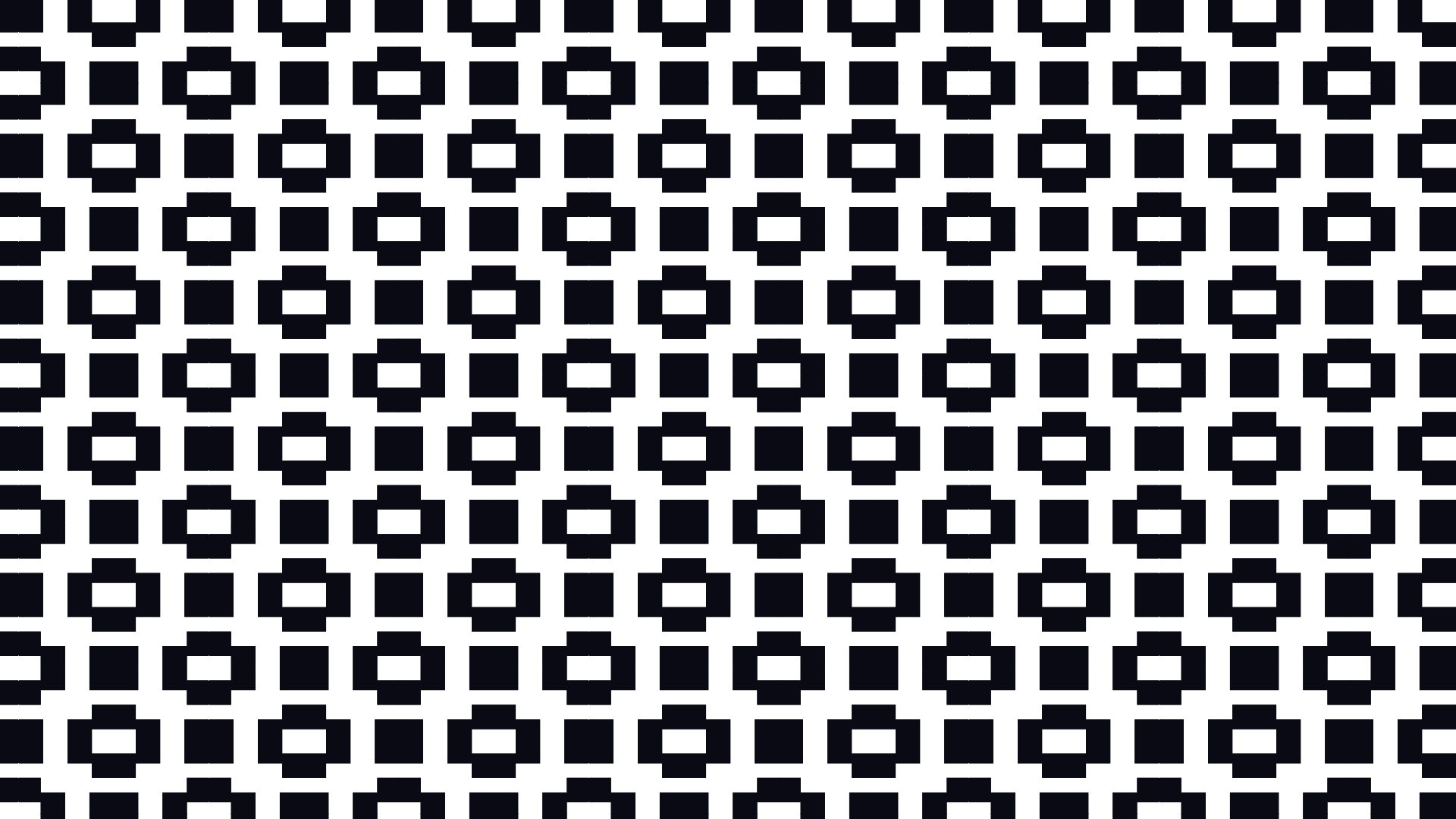
Patterns that sting
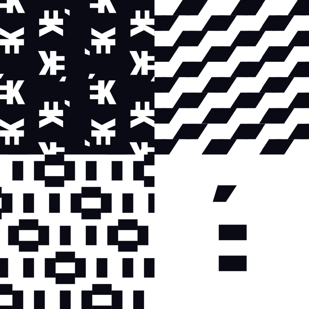
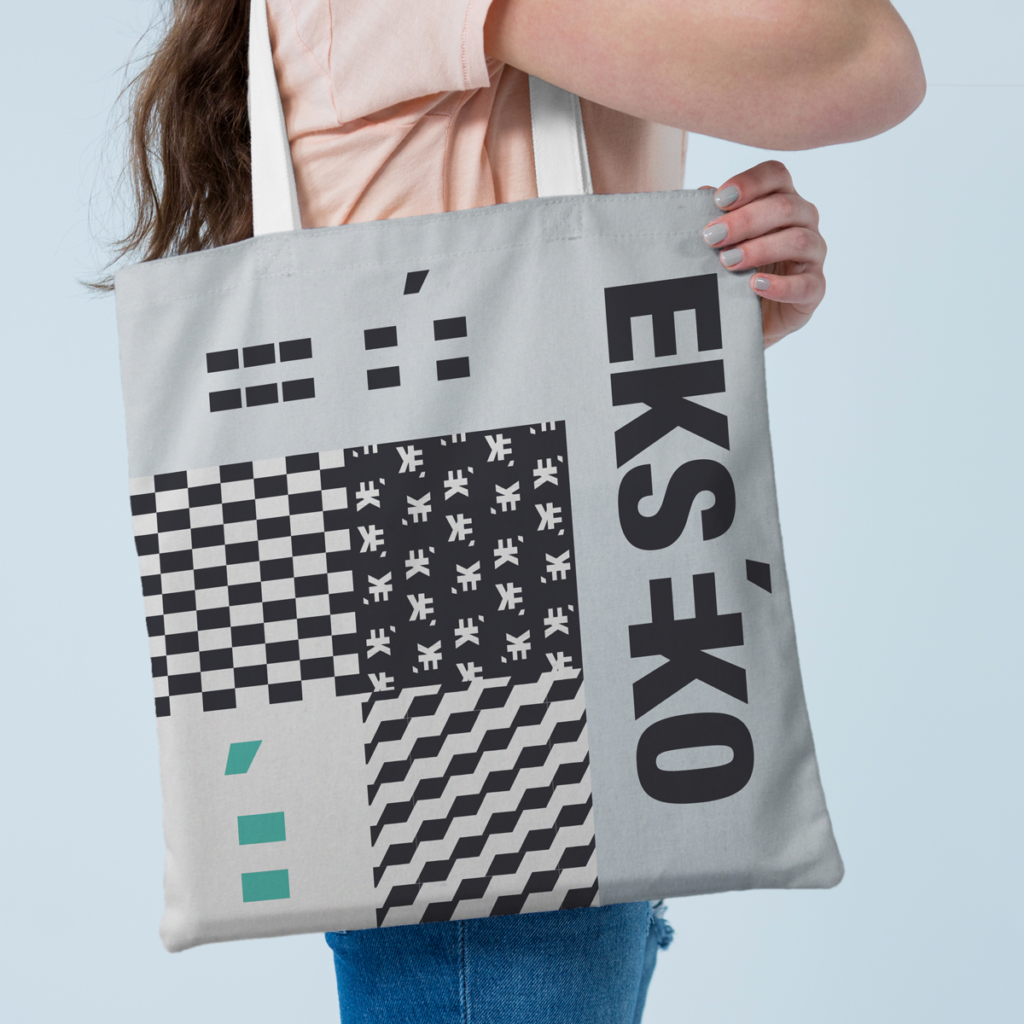
Another significant graphic element in Ekséko’s branding is its patterns. Derived from elements of the logo, the intention is for them to be bold and somewhat discomforting to the eyes. The concept behind this is to allow individuals without autism to experience a fraction of the sensory overload that those with autism may encounter. This additional graphic element contributes to the narrative of Ekséko.
Thanks Christopher for your clear design brief, inspiration and collaboration during this project.