Cleaning Industry / Brand Strategy / Brand Design / Employer Branding / Webdesign
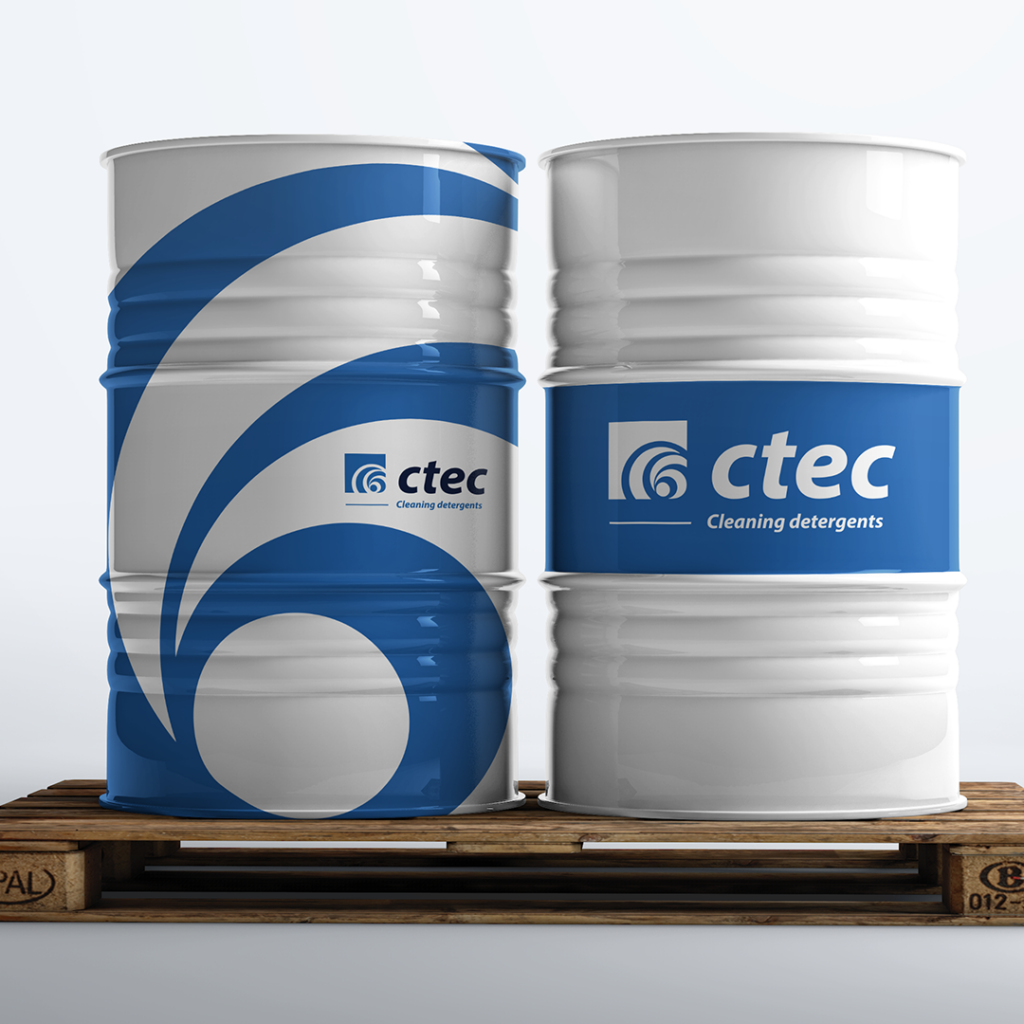
In 2021, I was approached to undertake graphic design work at CTEC, a company that was then part of the LW Group. As I delved into the company and its graphic assets, I noticed a lack of coherence in both the material and the story of the company and the group.
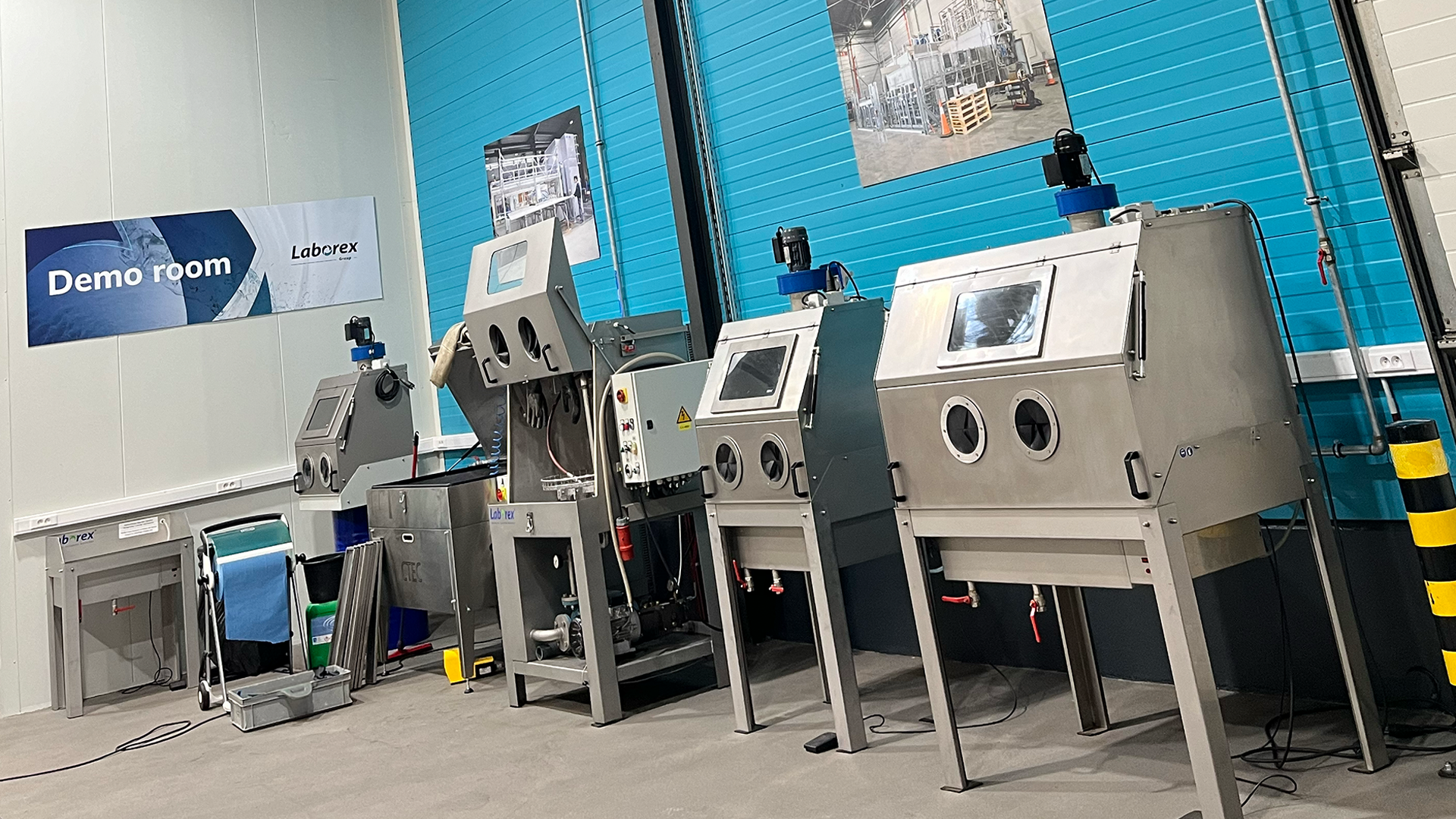
I learned that the LW Group holds several companies (Laborex, Laborex Waste Water Systems, FE Plus, Kloostertrots, Buwelco) in its portfolio that collectively build industrial cleaning machines. Alongside CTEC, which provides the chemical cleaning products for these machines, they can offer a comprehensive solution for various specific cleaning needs for a wide range of organizations. They manufacture machines used for maintaining the internal mechanics of wind turbines or smaller machines in which a mechanic can clean engine parts, among other applications. It’s an intriguing product range, presenting an interesting case within a less conventional market.
While I initially created the graphic material, I also proposed a comprehensive Brand Strategy and (Re)Branding approach for all companies within the LW Group. Several years of fruitful collaboration culminated in this summary case.
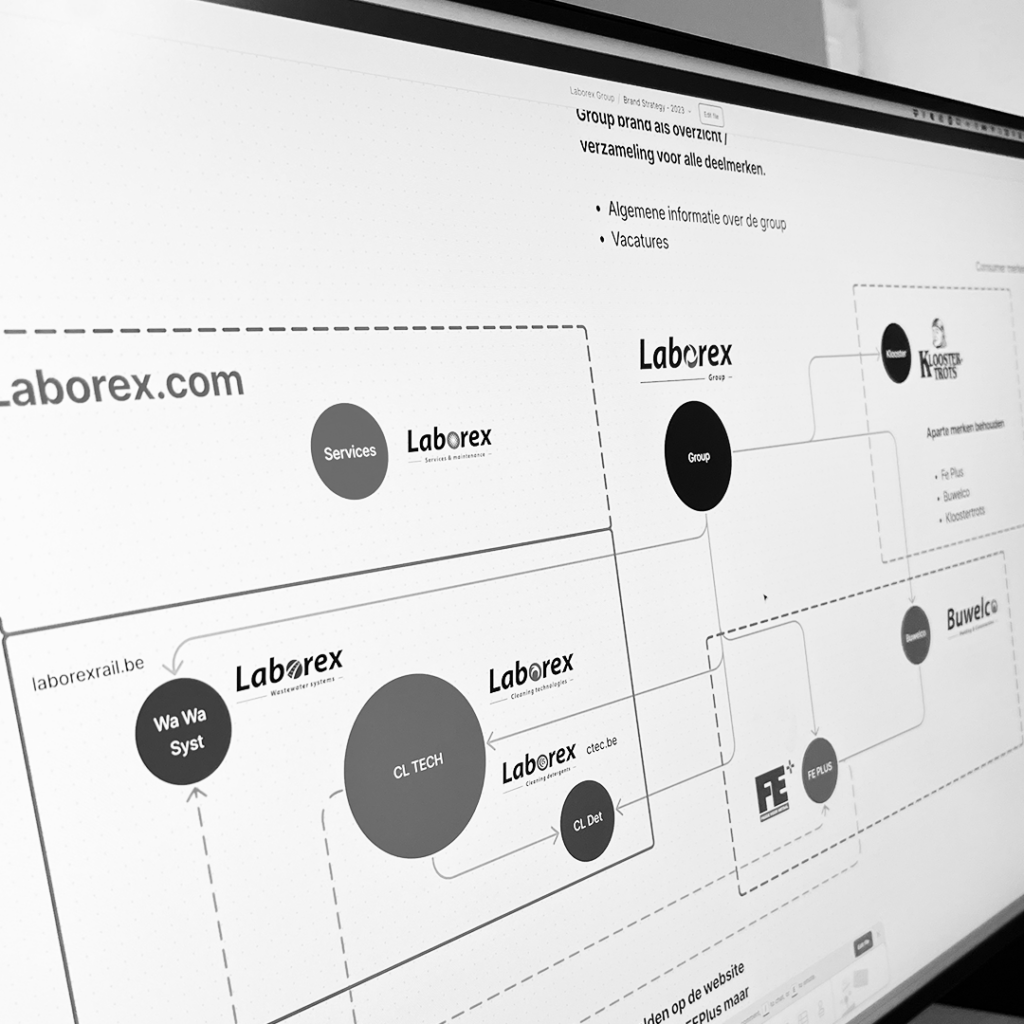
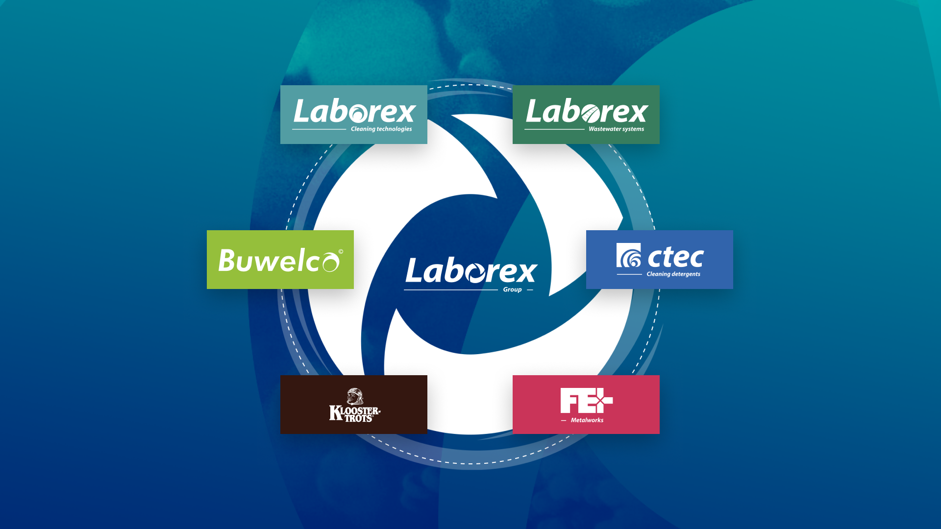
I noticed a lack of coherence in the narrative of the LW Group and its subsidiary companies. Each entity seemed to operate somewhat independently, despite collaborating with one another. Working closely with LW Group management, we conducted a series of strategic workshops to define the group’s desired external image for the coming years. Together, we explored how to logically cluster the companies within the marketing narrative and established the Laborex Group to replace the LW Group.



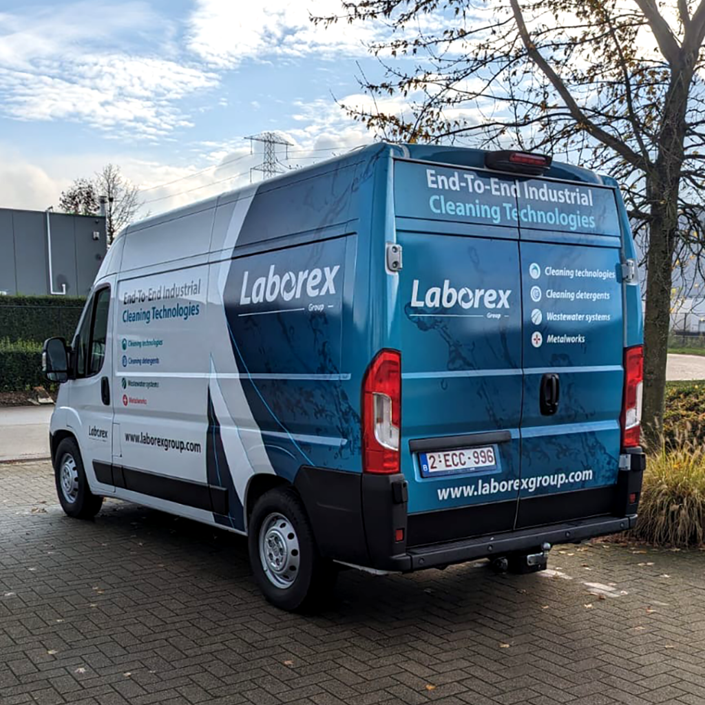
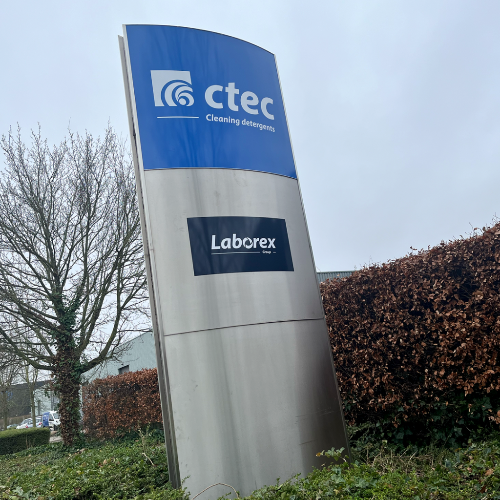
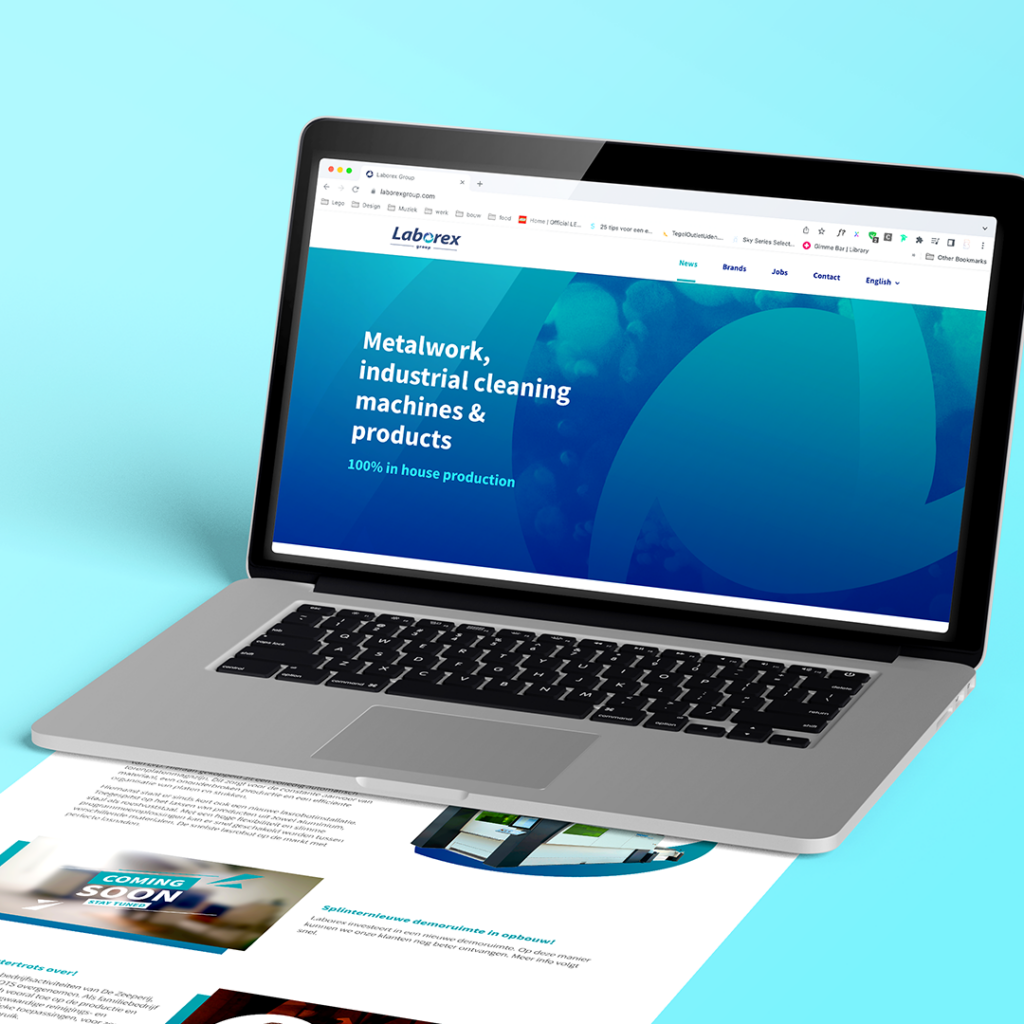
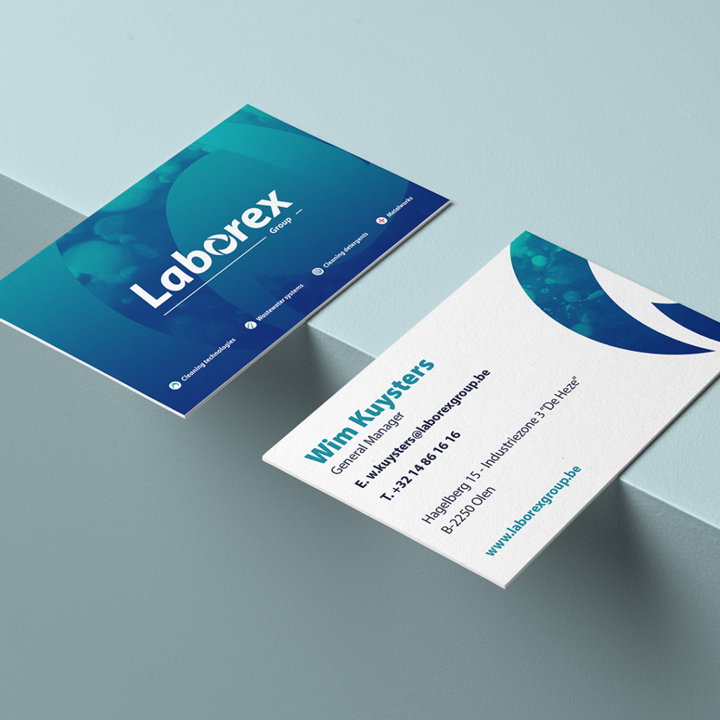

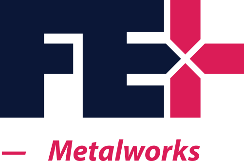
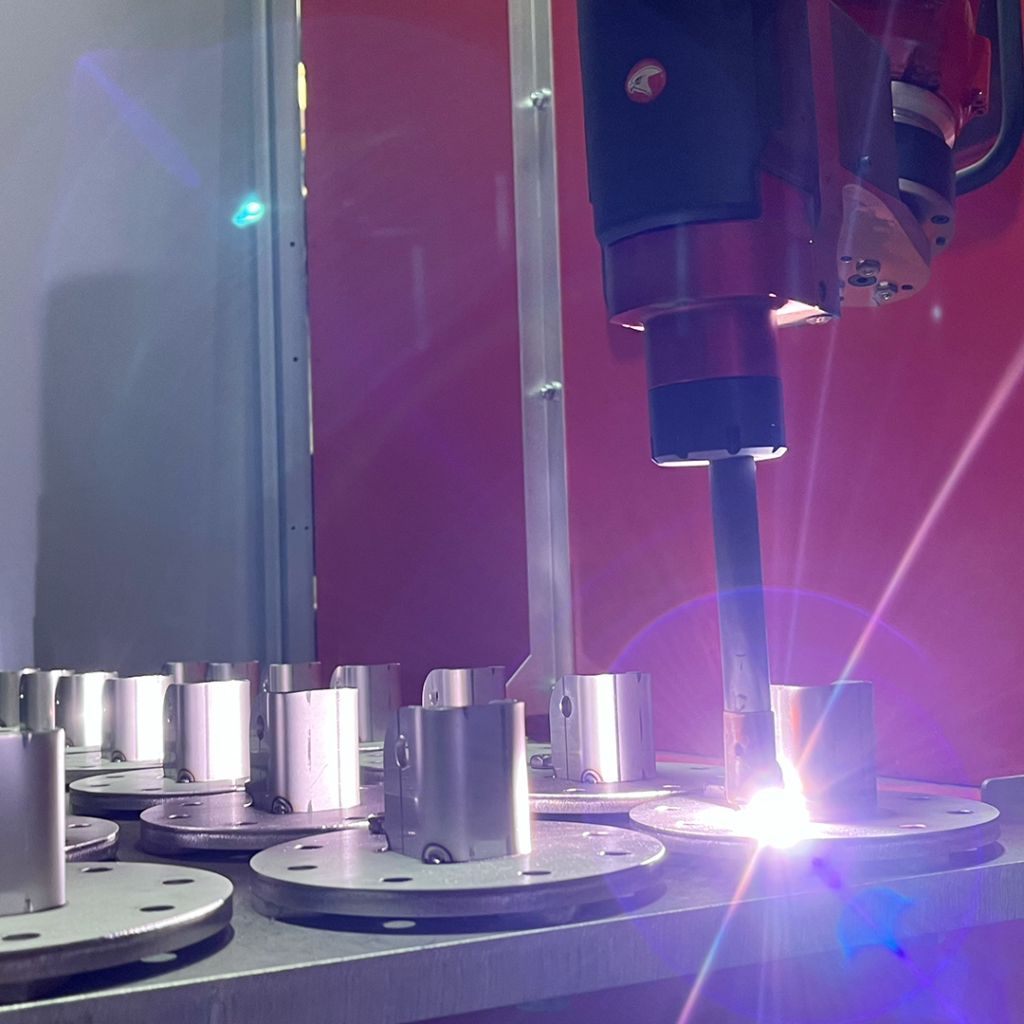
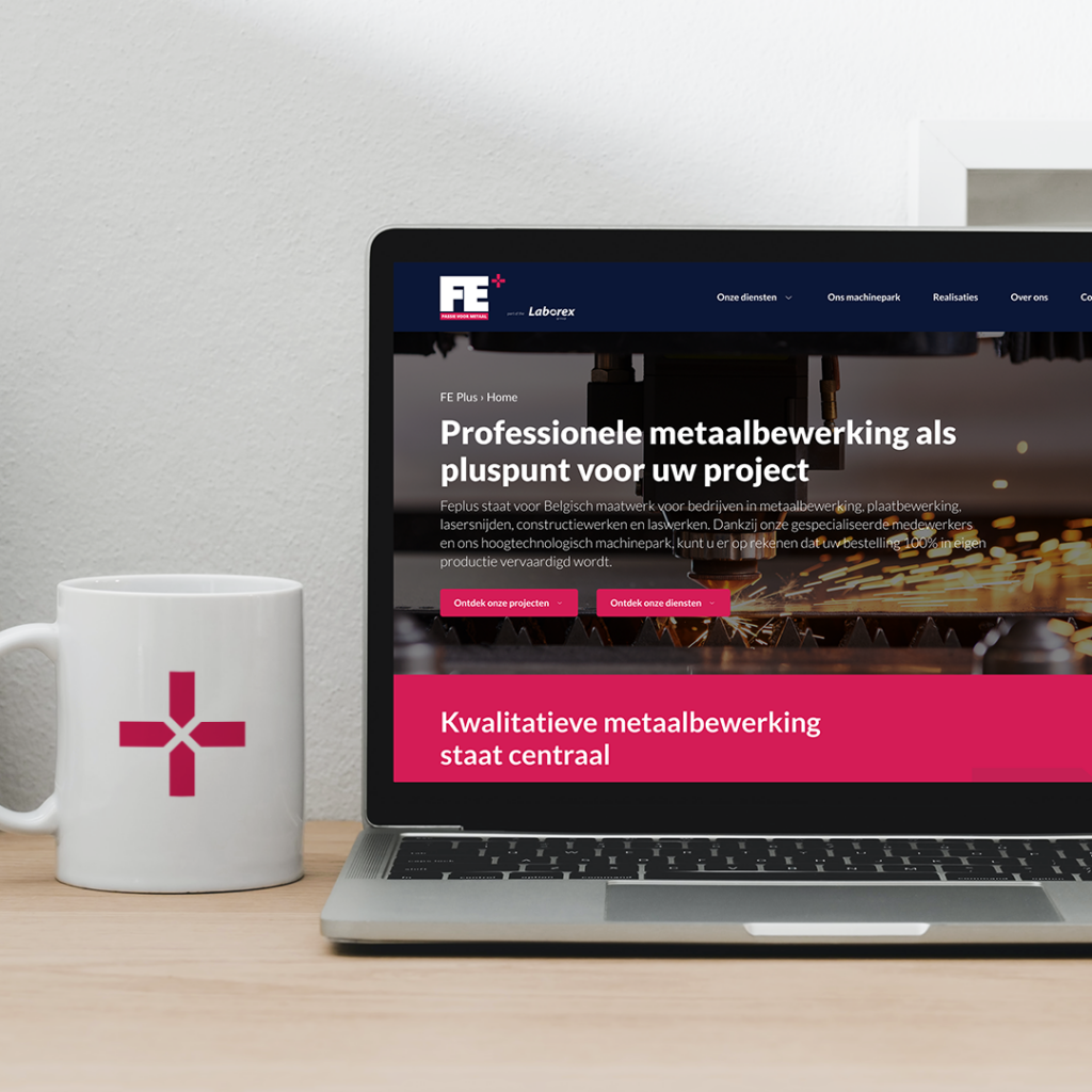
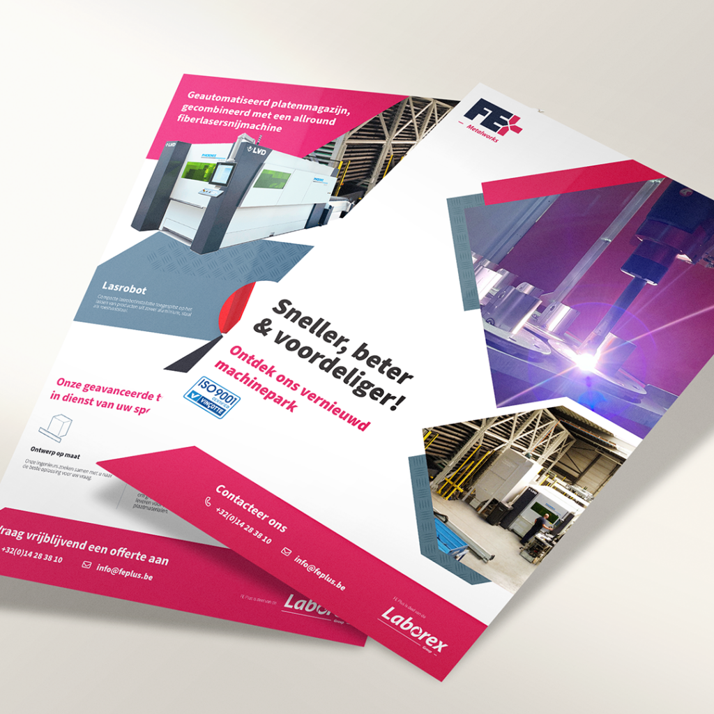
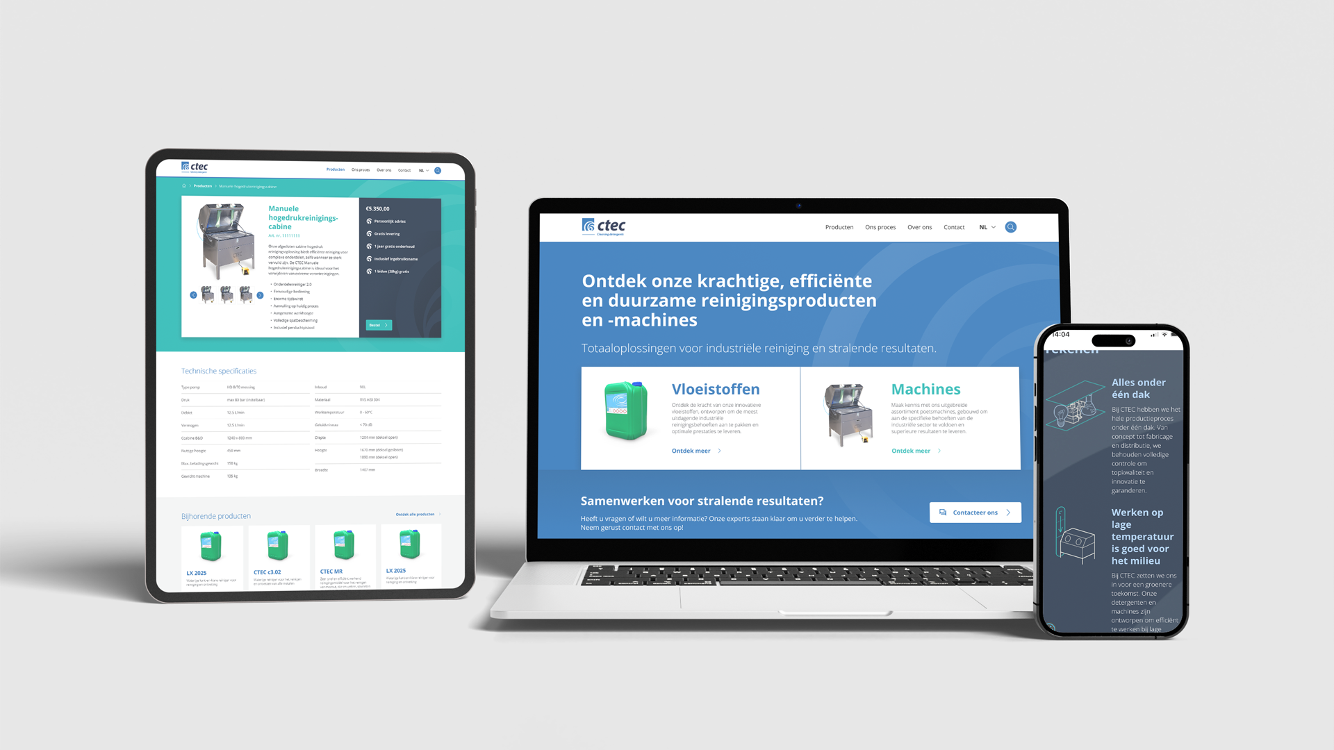
After establishing the Laborex Group, the first priority was rebranding FEPlus. The focus was on a complete makeover while aligning the new brand design with the overall transformation of the Laborex Group. The decision was made to retain the FEPlus name, with a simple tweak to the logo integrating “the plus” into the wordmark for consistency and cohesion. In line with the logos of other brands, the new tagline “Metalworks” was also added. Additionally, significant attention was given to enhancing the online presence, including a new website and updated marketing materials for sales teams. Photography underwent a thorough revision, with new guidelines emphasizing a modern, fresh look, avoiding artificial imagery and opting for authenticity. No AI images were used; instead, real photography was prioritized.

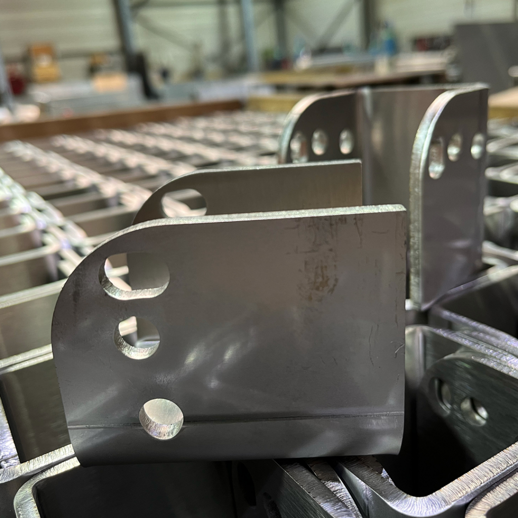
After establishing the Laborex Group, the first priority was rebranding FEPlus. The focus was on a complete makeover while aligning the new brand design with the overall transformation of the Laborex Group. The decision was made to retain the FEPlus name, with a simple tweak to the logo integrating “the plus” into the wordmark for consistency and cohesion. In line with the logos of other brands, the new tagline “Metalworks” was also added. Additionally, significant attention was given to enhancing the online presence, including a new website and updated marketing materials for sales teams. Photography underwent a thorough revision, with new guidelines emphasizing a modern, fresh look, avoiding artificial imagery and opting for authenticity. No AI images were used; instead, real photography was prioritized.



Thank you Jan, Wim, and Luc for your trust and the pleasant collaboration so far. Thank you Kim for the great teamwork in marketing. This is just the beginning!