Social Services / Brand Design / Brand Strategy
People sometimes ask me: Why the mammoth in your logo? What does it have to do with being resolute? To me a mammoth is a sturdy animal, it can handle a punch, something that doesn’t move quickly, it stands out! Although they do not exist anymore I find these creatures intriguing. Still I find these characteristics something I would like to see back in my guitars. Sturdy, something on its own, a resolute quality, something that can take a punch. Who else doesn’t want that for their instrument?
Rik Van Renswoude
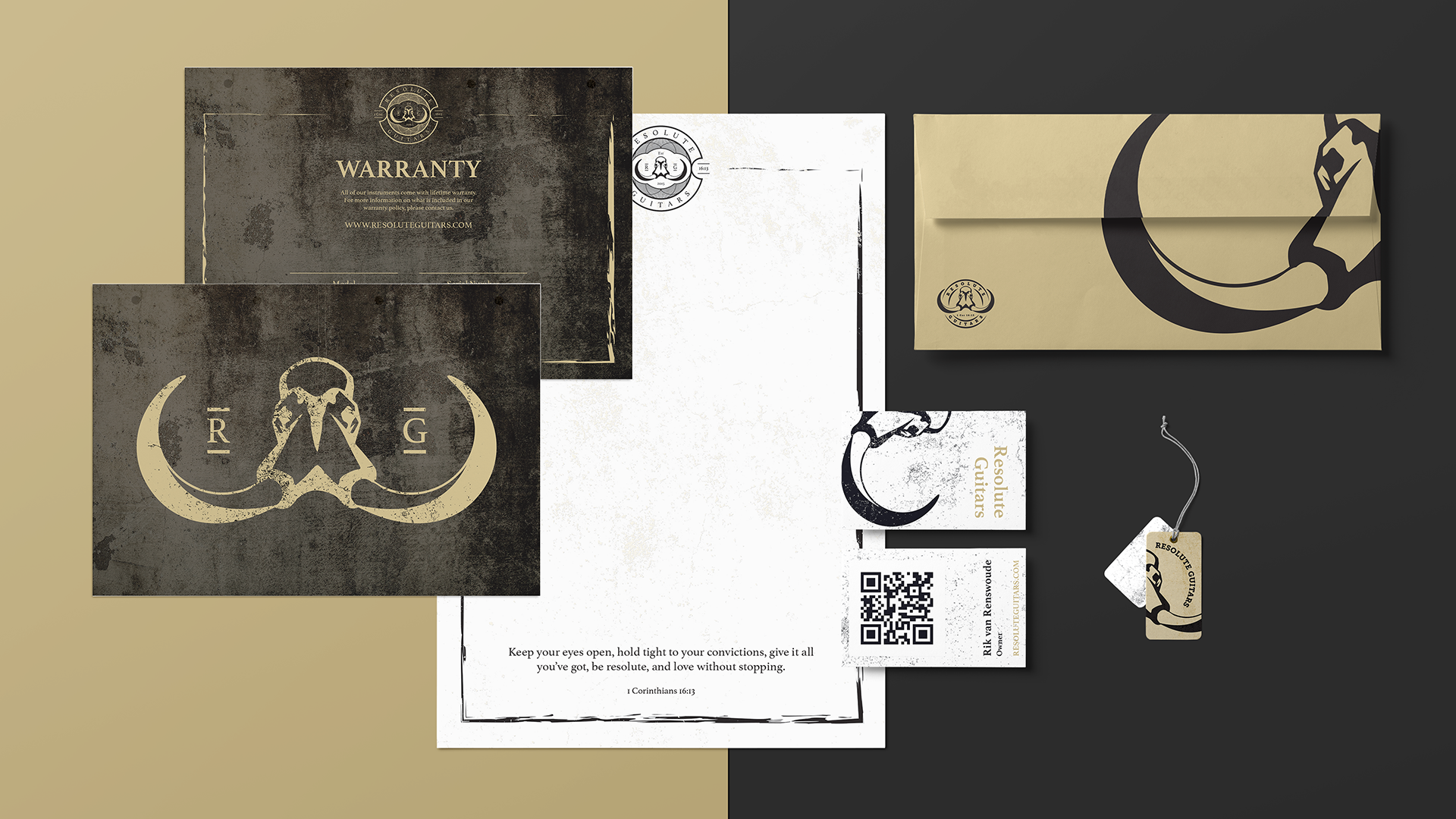
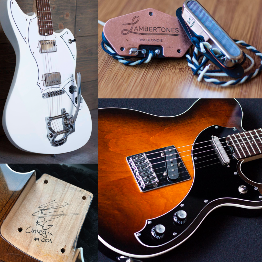
Built to be resolute! Rik knows what he wants. When he asked me to create a logo for his new venture as a guitar builder, everything fell into place almost instantly. “Keep your eyes open, hold tight to your convictions, give it all you’ve got, be RESOLUTE, and love without stopping” encapsulates the ethos of Rik & Resolute Guitars. The rugged, sturdy, and steadfast character is symbolized by the mammoth skull. As a design partner, I assisted in developing the entire branding for this fine guitar brand.
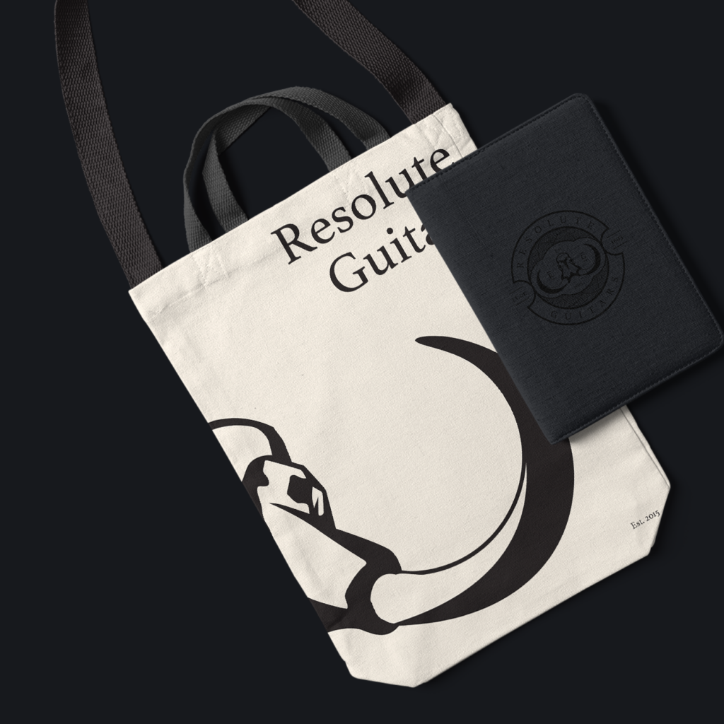
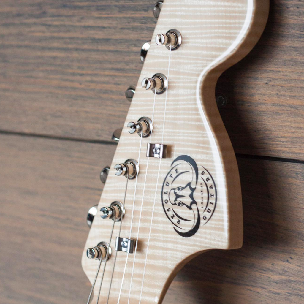
The Resolute Guitars logo needs to be clearly visible in various locations, such as the guitar neck, print materials, web, etc. Additionally, it should be capable of being engraved on wood or metal. Hence, we have developed different variations of the logo, some more detailed than others.
Thank you, Rik, for your friendship and trust! Let’s continue crafting those beautiful guitars.